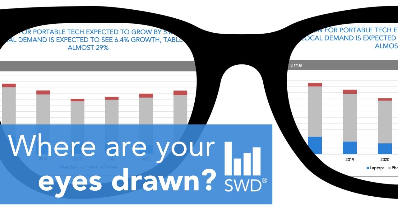
When you create a graph or slide you automatically know what the point is and how to read it. This makes it challenging to determine whether the visual you’ve designed is effective. The good news is you can ask yourself one simple question to get a sense of how someone else might process your communication and make refinements from there. See this technique in action as data storyteller, Alex, redesigns a data-driven slide.
JUMP TO THE SECTION THAT INTERESTS YOU
00:00 - Intro
00:30 - Ask yourself this simple question
01:03 - How do you process this slide?
02:45 - Step through the data viz makeover
05:29 - Compare the before and after
HONE YOUR DATA VISUALIZATION & DATA STORYTELLING SKILLS
📊 Practice in the #SWDcommunity: https://community.storytellingwithdata.com/
🎧 Listen to #SWDpodcast: https://www.storytellingwithdata.com/podcast
📚 Read the #SWDbooks: https://www.storytellingwithdata.com/books
🖥 Follow the #SWDblog: https://www.storytellingwithdata.com/blog
🍎 Attend a #SWDworkshop: https://www.storytellingwithdata.com/public-workshops
STAY CONNECTED
👉 LinkedIn: https://www.linkedin.com/company/storytelling-with-data-llc
👉 Twitter: https://twitter.com/storywithdata
💡 Don’t forget to subscribe for new videos! https://www.youtube.com/c/storytellingwithdata?sub_confirmation=1


0 Comments